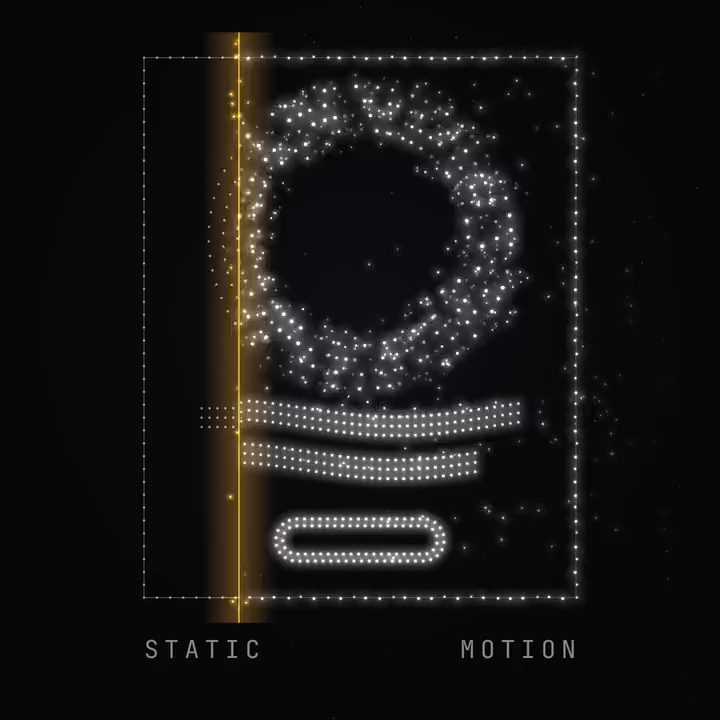
Your static ads may already be moving. Meta's Advantage+ creative enhancements, on by default, add music to statics and animate or move their text, and its generative suite turns images into video (AdLibrary). Unless someone on the team switched those settings off, your best-performing static is being put in motion in Reels and Stories, the platform's way.
That's a sign of where the placements are. Reels, Stories, TikTok and YouTube are built for motion, and a still image in a video slot looks like it wandered in from somewhere else. Your best statics are designs that already proved themselves, with a layout, a headline and an offer that convert. The question is how to put them in motion your way, without losing what made them work.
Which statics to animate first
Start with the statics that have carried the most spend for the longest. They're the designs your audience already responds to, and a motion version lets the same idea into placements a static can't reach. Then look for statics whose message already has a sequence in it: a before and after, a number that changes, a step that leads to a result. That's where motion adds something, because the viewer sees the change happen instead of reading about it.
Treat the motion version as a test
Motion isn't automatically better. ATTN Agency's 2026 benchmarks put video CTR at 1.9% against 1.1% for static, but CPA at $48.20 against $34.50, so the static still won on cost in that data (Segwise). Run the motion version alongside the static in the placements where video belongs, and keep both if both pay.
Keeping the design intact
There are two common ways to put a static in motion, and each costs something.
Preset animation keeps the design and moves it the template's way. In Canva you pick slow, medium or fast presets or set exact durations, and each animation runs up to 10 seconds (Lilach Bullock). The design survives, and it moves like every other design using the same preset.
Generative motion goes the other way. Canva's image-to-video turns an image into a silent clip of about five seconds, and reviewers warn that generative motion can distort small text, flicker logos and warp packaging (Wondershare), exactly the parts that made the static work.
What you want is in between: the design kept as it is, moving the way your brand moves. That means animating each element separately: the headline, the price, the button and the logo, and, if it should move at all, the product image.
Every size from the motion version
Once the motion version is approved, lay it out again for each placement, 9:16, 4:5, 1:1 and 16:9, rather than cropping it (every placement without cropping a frame). Then the offer can change and each language gets its own text without touching the approved motion.
Animating in layers
Motn brings the static in as layers, from the image or straight from its Figma frame. The headline, the price and the button stay live text, and the logo stays the approved file. Claude animates each layer as code in the brand's motion style from the brand library, so the headline enters the way the brand's titles always do and the price counts up the way its numbers always move (the senior designer's decisions, built in). Where the product image should move, that one layer can get generated motion while the text and the logo stay untouched. App screens that need to move as well are covered in product demos that update with the app.
Start with your three best statics from the last quarter, or book a demo and bring them along.